- 미국 주간 실업수당 청구 26만건…“노동시장 냉각 우려”
- 미국에서 한 주 동안 접수된 실업수당 청구 건수가 연중 최고치에 근접한 것으로 나타났다. 전문가들은 이를 두고 노동 시장 냉각 신호로 해석하고 있다. 4일(현지시각) 미국 노동부에 따르면 지난 7월 30일 마감된 일

Since August, when July's economic data for the US market began to be released, there have been several jolts related to new employment, unemployment rates, and initial jobless claims. The issue of Sahm's rule, a statistical indicator of past recessionary periods, also briefly swept through the market.
While US GDP and consumption indicators remain robust, employment indicators have shown some unsettling signs since mid-year, experiencing occasional jolts.
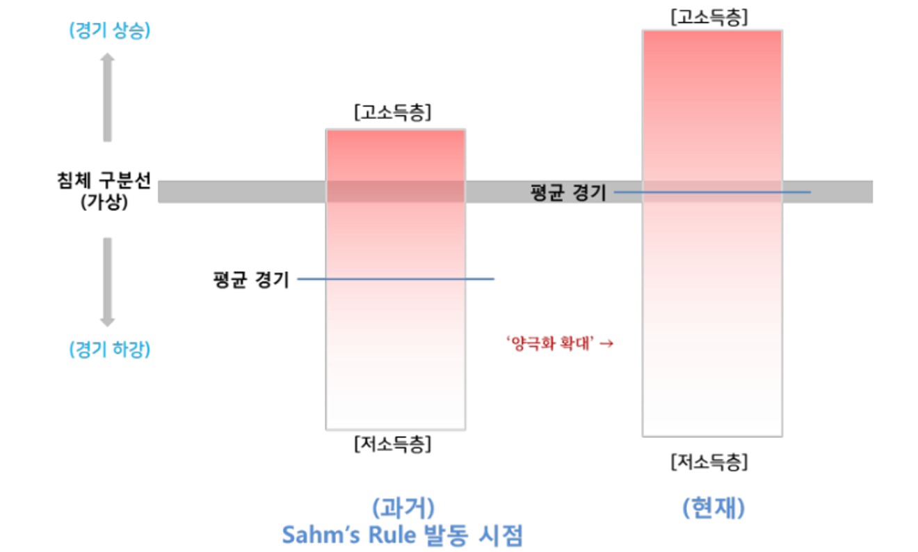
This is likely due to the increased polarization in the US following the COVID-19 pandemic, as depicted in the chart from a previous post.
Job losses initially impact the lower and working classes. However, overall production, income, and consumption are driven by the middle and upper classes and wealthy individuals. Therefore, while employment indicators show signs of a potential recession, consumption indicators remain positive.
Meanwhile, last week and the week before, there was a surge of interest in the weekly initial jobless claims data released in the US every Thursday morning, a figure typically overlooked.
The US stock market experienced a slight dip last week when the figure exceeded 260,000, generating significant news coverage. However, last week's figure of around 240,000 led to a sense of normalcy. Let's briefly examine the reasons behind these temporary market reactions.

- 美 실업수당 신규 청구 24.1만건…예상치 하회
- 미국 노동부는 지난주(10월 6∼12일) 신규 실업수당 청구 건수가 24만1천건으로 지난주보다 1만9천건 증가했다고 17일(현지시간) 밝혔다. 이는 다우존스가 집계한 전문가 전망치(26만건)를 밑도는 수준이다. 2주

I previously provided a brief overview of the composition of US employment statistics (new jobs and unemployment) and where to find them in the following article.
The nonfarm payroll employment figures from the Bureau of Labor Statistics (BLS), released on the first Friday of each month, are divided into establishment surveys (based on company payroll records) and household surveys (based on individual surveys). The survey items are structured as shown in the table below.

<Establishment Survey (by payroll): Non-farm employment>

<Household Survey (by survey): Employment, Unemployment, Unemployment Rate, etc.>
While the household survey includes data on monthly new employment and total employment levels, the establishment survey's payroll data is considered more reliable. Therefore, the employment figures from the establishment survey (All employees: total nonfarm) are used as the official headline figures.
Unemployment rate data (unemployed/labor force) is obtained solely from the household survey. Therefore, the household survey results are used for the headline unemployment rate. The headline figures for new employment and unemployment rate, typically covered in news reports immediately following their release on the first Friday of each month, come from different survey methods.
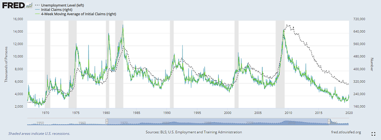
Before examining weekly jobless claims, let's look at the official trend of unemployment. The official monthly unemployment figures come from the Department of Labor's nonfarm employment report. The graph below (dotted line) shows the long-term trend of the US unemployment level (monthly data).
Past official recessions (shaded gray) show that unemployment levels (similar trends for unemployment rates) decreased slightly during boom periods, but once this downward trend stopped and reversed, it would sharply increase, marking the start of a recession. Except for "this time" in 2024.
This explains the considerable discussion surrounding Sahm's rule in August. However, this time, while the unemployment rate has stopped declining, consumption remains strong due to increased polarization, preventing a sharp rise in unemployment. It seems that the recession might take longer to arrive compared to previous instances; it's not a case of ending abruptly.
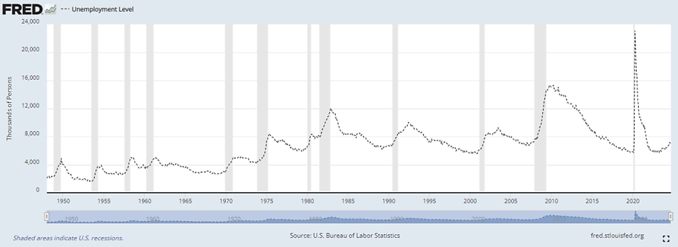
(Monthly) Unemployed
The graph below adds the weekly initial jobless claims data (solid line) to the monthly unemployment data. The added data represents the "Initial Claims" from the jobless claims data.
Although the trends appear similar at first glance, the significant spike during the 2020 COVID-19 pandemic obscures the view. The pandemic significantly distorted most economic data, making analysis difficult. Let's examine the data up to January 2020, before the pandemic, for better visibility.
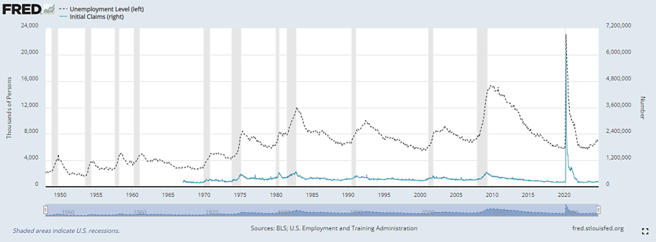
Unemployed, Initial Claims
The graph below shows the data up to just before the COVID-19 pandemic. The vertical axis is split for each data series, allowing for a comparison of trends excluding the pandemic period.
The data shows the number of people newly applying for unemployment benefits weekly, resulting in significant week-to-week fluctuations. However, over a longer timeframe, the general trend roughly matches the monthly unemployment level trend.
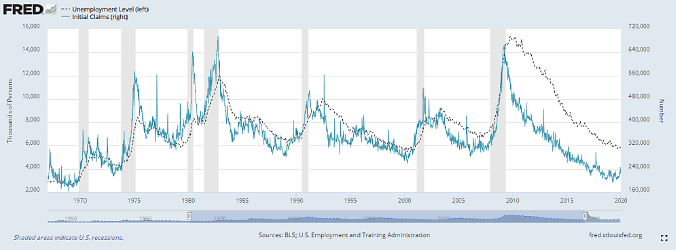
Unemployed, Initial Claims (Pre-COVID)
The graph below adds a four-week moving average (green line) of the initial claims data. This isn't intended to provide special meaning, but rather to smooth out the jagged weekly initial claims data for easier viewing.
Unemployed, Initial Claims, 4-Week Average of Initial Claims (Pre-COVID)
(To be continued in Part 2 due to space limitations)
Comments0